Your first filmstrip
in 5 minutes
Open StripKit, drop in your transparent PNG, choose a control type, and hit Export. This guide walks you through every step — and shows you how to load the result straight into JUCE.
The core workflow
Five steps from a blank canvas to a shippable, loader-ready sprite sheet.
Load your source art
Drag-and-drop a transparent PNG onto the preview area, or click Load source image… in the Create tab. StripKit accepts any PNG with an alpha channel — a knob face, fader cap, slider thumb, meter art, or a layered SVG / PSD.
On load, StripKit automatically detects the opaque-content centre and uses it as the rotation pivot. For most well-prepared art this just works with no manual adjustment.
Choose your control type
Pick one of the six types in the Type dropdown. The type determines how the per-frame transform is computed:
- Knob — rotary sweep, default 270° (-135° to +135°)
- Fader — vertical cap that travels a fixed pixel distance
- Slider — horizontal cap, same travel logic as Fader
- Meter — progressive fill; procedural or layered art
- Button — discrete state frames (off / on, plus optional pressed & disabled)
- Toggle — a latching on/off pair, rendered like a 2-state button
Set frame count & sweep
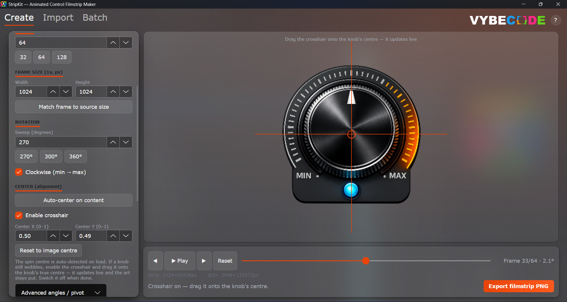
Frame count controls how smooth the animation looks and how large the output file is. 64 frames is the right default for most UIs.
- 32 frames — compact; looks good at small on-screen sizes
- 64 frames — standard; smooth at typical 64–128 px knob sizes
- 128 frames — premium; ideal for large or HiDPI knobs
For knobs, adjust the start/end angles if you need a range other than 270°. For faders and sliders, set the travel distance in pixels (how far the cap moves from minimum to maximum).
N−1, not
N. This is by design: frame 0 = min, frame N−1 = max.
Preview and align
The live preview updates whenever you change a setting. Drag the scrubber to step through frames, or press Play to watch a looping animation.
If the knob wobbles, the auto-detected centre may need adjusting. Use any of these tools in the Alignment panel:
- Auto-centre — recalculates from the opaque bounding box
- Crosshair guide — drag a visual overlay to pin the exact spin centre, then click Pin
- Centre X / Y — type a fractional value directly (0.5, 0.5 = image centre)
Export your filmstrip
Click Export filmstrip… and choose a save
location. StripKit writes a vertical PNG — frame 0 at the top,
frame N−1 at the bottom. Total height is
frameHeight × frameCount.
- HiDPI export — write an upscaled copy at @2x, @3x, or @4x for high-density displays; name ends in
@2x.png,@3x.png, etc. - skin.json manifest — a schema-valid JSON file that binds the strip to a parameter id and records its dimensions
- Loader code — pick JUCE, iPlug2, CSS/HTML, HISE, or React; StripKit writes a ready-to-paste file next to the PNG
- Sprite layout — a single strip (default) or a row×column grid atlas for loaders that expect one
.juce.h file alongside the
PNG — copy it into your project and you're done.
What each type needs
Each control type has its own art requirements and per-frame rendering logic.
Knob
A rotary control swept through a customisable arc.
- Transparent PNG of the full knob face
- Default sweep: 270° (−135° → +135°)
- 64 frames recommended
- Layered mode: static base + rotating pointer
Fader
A vertical cap that travels the length of a track.
- Transparent PNG of the cap only
- Set travel in pixels (min → max)
- Frames stack vertically by default
- Track background drawn separately in your plugin
Slider
A horizontal cap — same logic as Fader, rotated 90°.
- Transparent PNG of the cap only
- Set travel in pixels (min → max)
- Cap moves left to right
- Track background drawn separately in your plugin
Meter
A progressive fill — procedural or layered art.
- No art needed for procedural mode
- Layered mode: source = lit-segment overlay
- Four fill directions (up/down/left/right)
- Discrete or continuous fill
Button
Discrete state frames — one per UI state.
- Layered SVG / PSD with off / on groups
- Optional pressed & disabled states
- One frame per state, not a sweep
- The Generate tab can make the art for you
Toggle
A latching on/off pair, like a 2-state button.
- Just the off + on frames
- Switch-style generated art
- Latching code-export binding
- Rendered exactly like a 2-frame button
Load the strip in your plugin
A single LookAndFeel override is all you need.
StripKit can generate this file for you — enable
Export loader code → JUCE in the Export panel
before you click Export.
// MyKnobLookAndFeel.h — generated by StripKit (https://stripkit.pro)
// Filmstrip: knob_strip.png — 64 frames, 128×128 px each, vertical stack.
// Assign to your Slider: slider.setLookAndFeel(&lnf);
// Use RotaryHorizontalVerticalDrag style.
#pragma once

#include <juce_gui_basics/juce_gui_basics.h>
#include <cmath>

class MyKnobLookAndFeel : public juce::LookAndFeel_V4
{
public:
    MyKnobLookAndFeel()
    {
        // Embed via Projucer / CMake BinaryData (recommended).  Alternatively:
        //   filmStrip = juce::ImageFileFormat::loadFrom(juce::File("knob_strip.png"));
        filmStrip = juce::ImageCache::getFromMemory(
            BinaryData::knob_strip_png,
            BinaryData::knob_strip_pngSize);
    }

    void drawRotarySlider(juce::Graphics& g,
                          int x, int y, int w, int h,
                          float pos, float, float,
                          juce::Slider&) override
    {
        const int frames = 64;
        const int frameW  = 128;
        const int frameH  = 128;
        const int frame   = juce::jlimit(0, frames - 1,
                                (int) std::lround(pos * (frames - 1)));

        g.drawImage(filmStrip,
                    x, y, w, h,              // destination rect
                    0, frame * frameH, frameW, frameH); // source frame
    }

private:
    juce::Image filmStrip;
};
knob_strip.juce.h alongside your PNG with the exact frame count,
frame dimensions, and stack direction already filled in. iPlug2, CSS/HTML, and
HISE targets are available in the same panel.